Where’s the Proof?
5 Dashboards to Help You Justify Marketing ROI
by Nate Skinner
VP of Product Marketing, Salesforce Pardot
Learn which dashboards VP of Marketing Nate Skinner uses to visualize data and make data-driven marketing decisions.
Your campaign is a wonder. Prospects love it, it’s generating insane amounts of engagement, you’re doing the right thing, and then the CMO goes: “Sure, that campaign was great, but did it generate any business?” Every marketer has heard that at least once, and it’s about as deflating as getting a nail in your tire.
Without the right tools, tracking the return on investment (ROI) of marketing programs can be arduous and frustrating. Not only that, it could prevent you from making the right decisions, such as quickly course correcting or targeting the right accounts. Enter technology. The right tools can give marketers a deeper level of visibility into their campaigns and the effectiveness of their overall strategies. They can make it easy and efficient to create insightful ROI reports, and share them with your C-suite—all with just a click of a button.
Using Salesforce and Einstein Analytics dashboards, we’ve put together some examples of the power of a clear, easy-to-use, beautifully rendered look at your data. Dashboards like these give the kind of detailed reporting and analytics capabilities that will make your CMO very happy indeed.
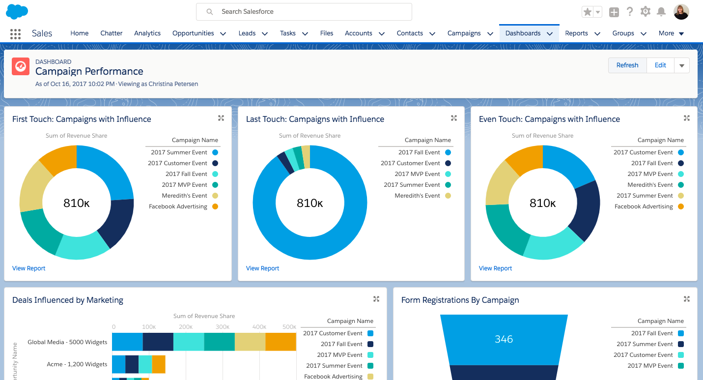
The Campaign Influence Dashboard
Understanding how campaigns influence pipe generation and progression is a view that’s long eluded marketers. In the past, these exact metrics could be found buried in a series of progressively more intricate queries hiding in Excel. Worse yet, they were typically generated long after a campaign had come and gone. Luckily, marketing has gone fully digital, and tech-happy marketers can embrace the simplicity of automatically having your data populated into a ready-to-use format.
Using Salesforce Campaign Influence dashboards, you can toss together a dashboard that can track the first and last touch a campaign has before a deal is closed. Behold: the very happy CMO.
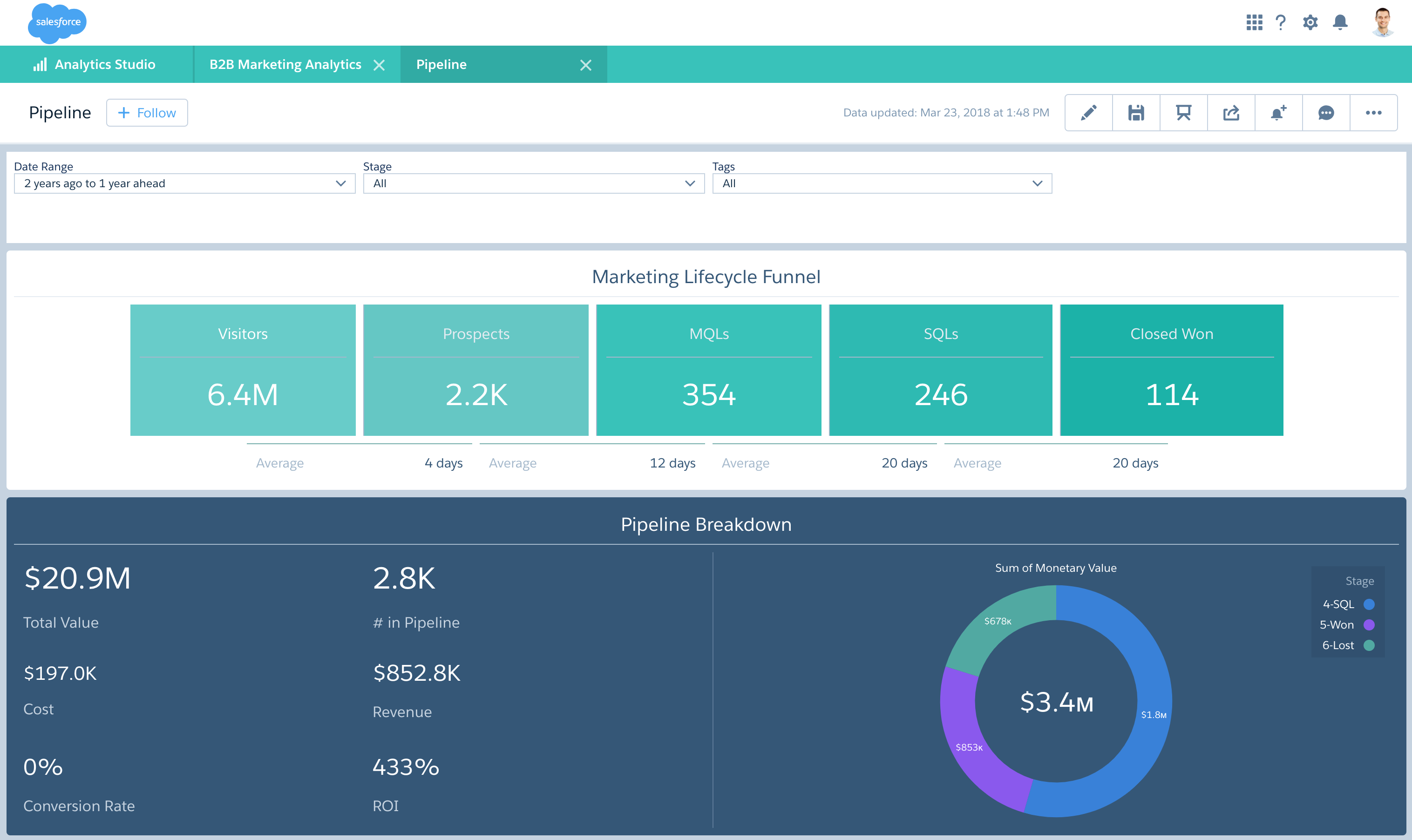
The Pipe Generation Dashboard
A pipe generation dashboard keeps marketing in the know where pipeline is concerned. You can dive into where it’s being generated, through what campaigns, and from what sources. Salesforce marketers use this dashboard internally every day because it keeps them in the know about how all of our lead sources and campaigns are performing. It also gives them the flexibility to monitor territory and segment performance in case they need to quickly refocus marketing resources.
Now let’s talk about metrics for a moment. Understanding the performance of their KPIs gives Salesforce marketers the ability to grow marketing ROI by course correcting weaker areas. It also takes the guesswork out of finding the stronger ones.
Some key components in this type of dashboard include performance metrics on:
- Segment
- Lead Source
- Sales Executive Targets
- Pipeline Sources
- Territory Targets
- Our Four Horsemen (Pipe generated by our top four sources: Account Executive, Sales Development, Business Development, and Cloud Sales Account Executive)
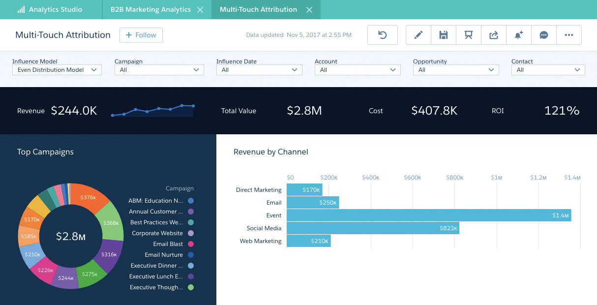
The Muti-Touch Attribution Dashboard
Now here’s where we get to the fun part. A multi-touch attribution dashboard is capable of breaking down all the touches that impacted a deal. This solves another little problem marketers have: getting their fair share of the glory when a deal closes. Multi-touch might just be revolutionary for helping marketing justify their wins as well as their return on investment.
The State of the Union Dashboard
Sales and marketing alignment is key to any successful business. If you’re trying to get your sales and marketing teams to see eye to eye (and who isn’t these days?), starting with shared metrics can really help. A State of the Union dashboard is all about giving both teams visibility into the metrics they share—and the metrics they don’t. If your marketing team hears things from sales like “I never know what they’re doing or how they’re impacting our business,” then using one of these can help sales see that marketing does care, they do want to work it out, and they just need sales to be willing.
Picture this: Your SVP of sales uses a State of the Union dashboard that has all of your top metrics and targets for the fiscal quarter and year. Whenever your VP of marketing has a meeting with the VP of sales, it’s the first thing they review together to maintain alignment—not just on current metrics, but also on shared goals, like growing pipeline by X amount, or increasing deal sizes.
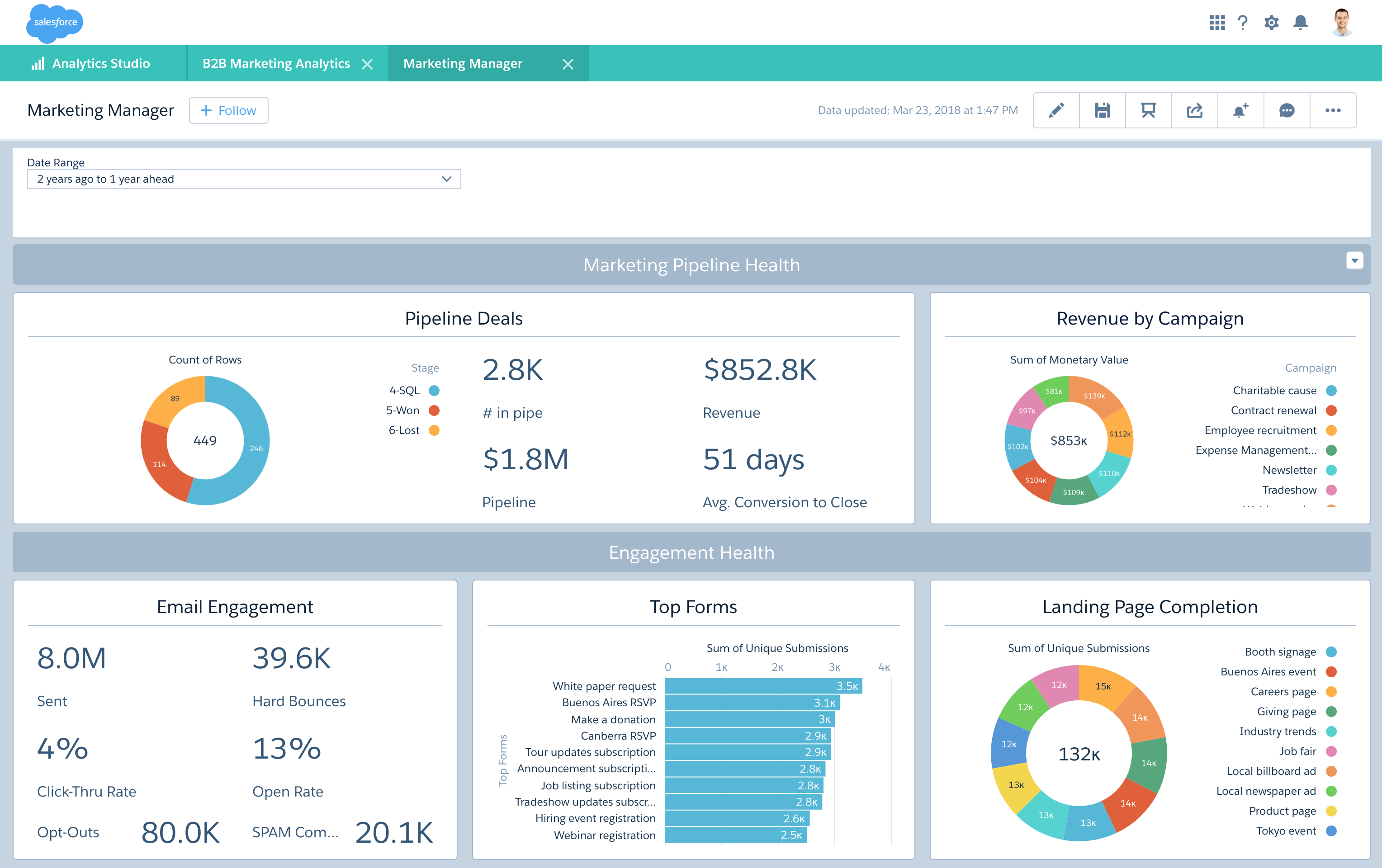
Marketing Manager Cockpit
This final dashboard may sound like a given, but you’d be surprised how easy it is to get caught up in the minutiae without realizing that you never really look at everything from a high level. Or maybe it’s not so surprising. Having a single source of truth for marketing KPIs is something every marketing manager should have for exactly that reason. Marketing is a fast-paced area of the business, so if you can’t get out of the trenches you’ll never see what’s coming.
Having these dashboards is going to make a big difference in the way you see your business—literally. But what will be even more powerful is what you do with that insight. How will you take your marketing further?